Drawing inspiration from the adjacent airport and Scandanavian design principles
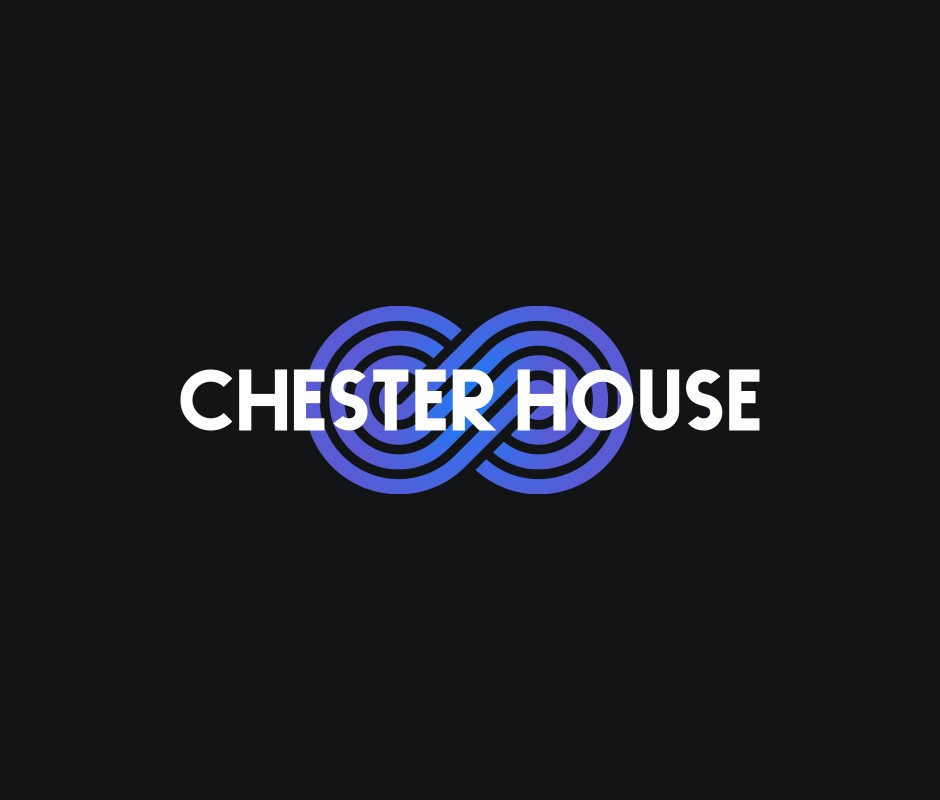
In proposing an alternative logo for Chester House during its rebranding process, I drew inspiration from the adjacent airport runways in Farnborough, which symbolised connectivity and movement. This concept utilised geometric shapes to convey dynamic energy and a sense of progress, distinct from the Bauhaus-inspired direction ultimately chosen. Embracing minimalist Scandinavian design principles, the proposed logo featured sleek typography with a refined sans-serif typeface. This choice emphasized Chester House's dedication to clarity and sophistication, ensuring the logo was both modern and timeless.
Complementing the typography, a minimalist symbol was integrated into the design, representing unity and growth. This abstract symbol aimed to capture Chester House's progressive outlook and forward-thinking approach in a subtle yet impactful manner. The color palette proposed consisted of modern and imapctful gradients, fostering a sense of new beginnings and brand adaptability across various applications—from digital platforms to printed materials.
Overall, this alternative logo concept sought to position Chester House as a contemporary and forward-looking brand within its location. While not ultimately selected, it presented a compelling vision that could have effectively enhanced Chester House's visual identity, distinguishing it in the marketplace while maintaining a sense of heritage and trustworthiness.